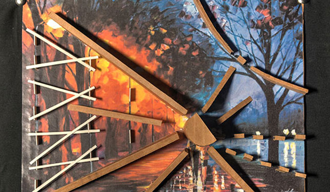
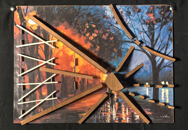
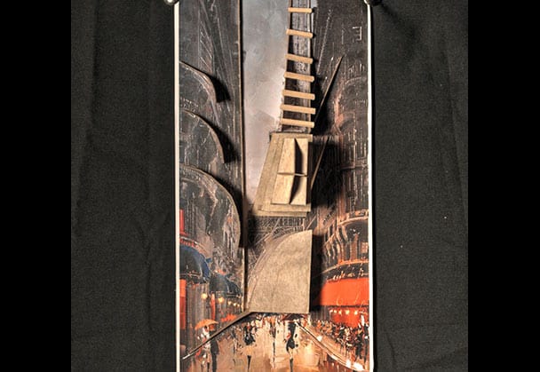
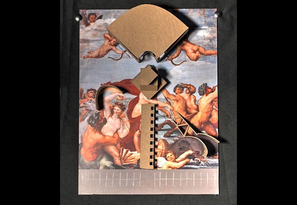
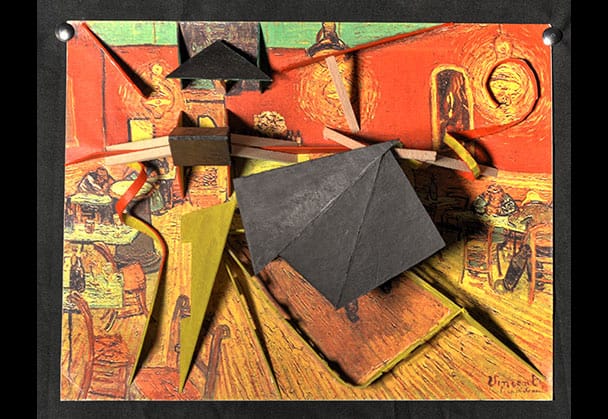
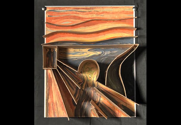
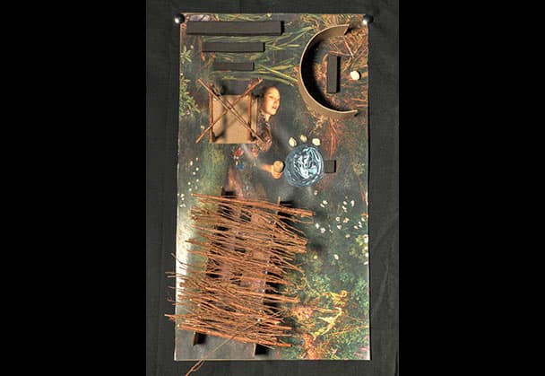
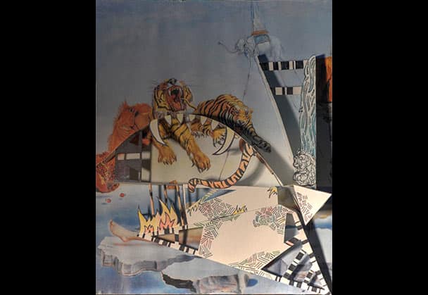
Diagramming Paintings is the title of the first project, and its underpinning is the notion that the greater part of learning to create as an artist is in learning to SEE. Students first study painting composition, gaining an understanding for how corners and edges are deemphasized, how linear and curved elements move through a painting, and how the eye is led towards focal points. This pivotal comprehension of visual movement helps students recognize the most important elements of a work. Once the diagram is created in two dimensions, the students build a model that dramatizes the lines and curves in an occupiable space with the painting as site plan. The expression of visual movement becomes a cornerstone. From the exercise, the students gain a strong capacity to emphasize the most essential elements in their own work.
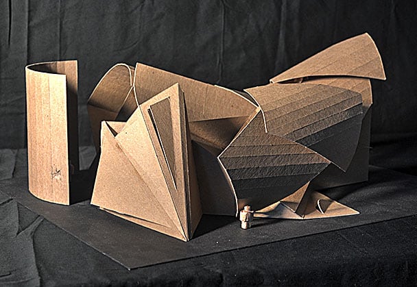
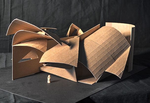
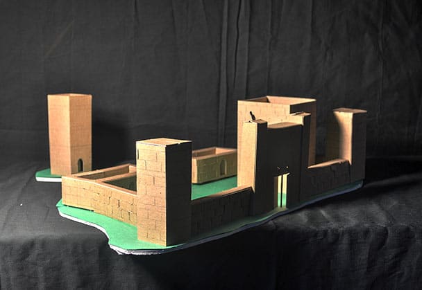
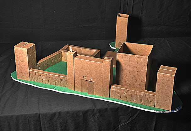
The abstract geometric structure and the castle are representative of the next project, an assembly of cardboard cards. The cards are limited in supply, and certain rules apply to their assembly. Bending and cutting of these elements are permitted, but not dissection or wholesale destruction. The limitations made on the project made for a response of inventive thinking, and several unusual, unexpected design solutions.
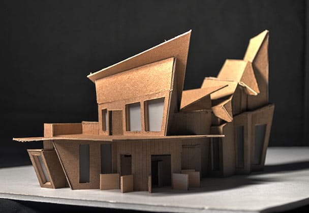
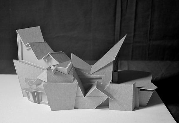
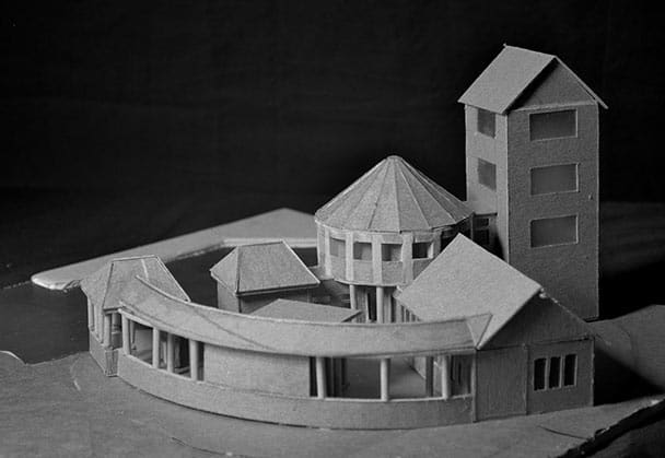
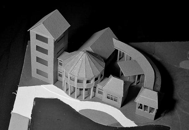
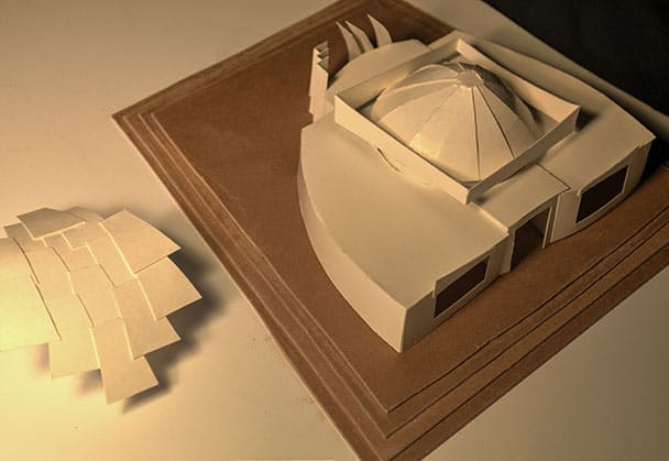
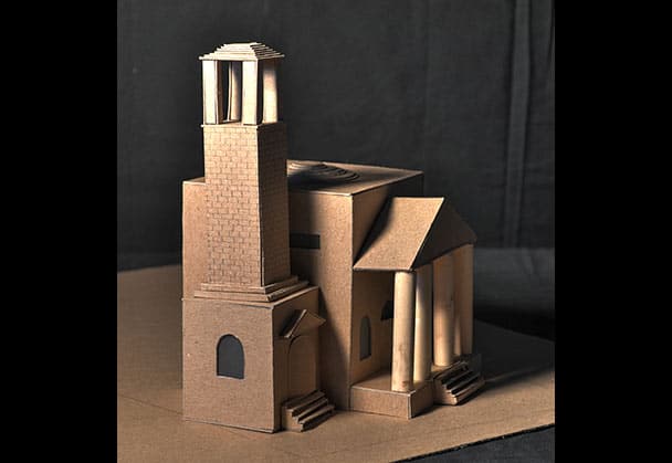
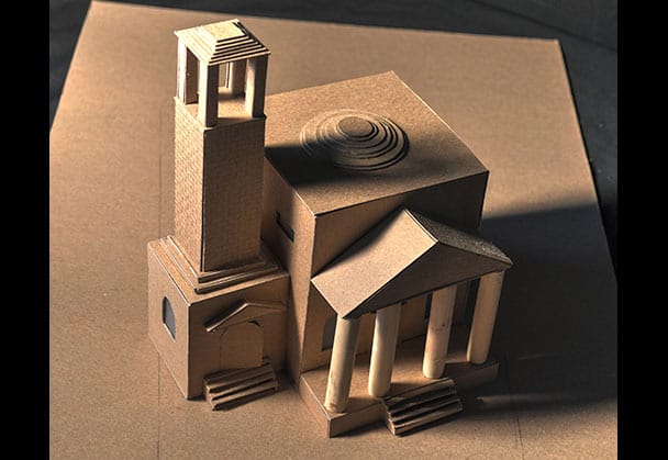
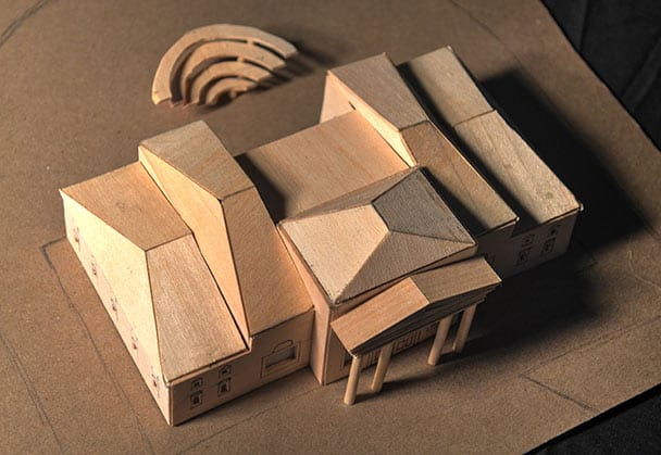
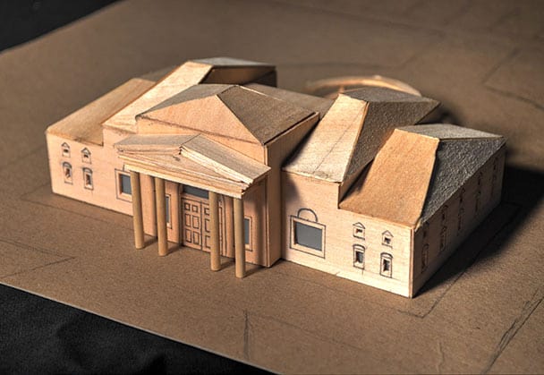
The City Visitor’s Center, an aforementioned project taking place in a local municipality, was the subject for this design. Students were boundless in their stylistic creativity on this project, composing classical, modern, postmodern and radical deconstructive solutions. They produced designs, generally, at an appreciably higher level of craft than earlier in the semester.
